


Shapely Projections
Tessa-Rose Vardy
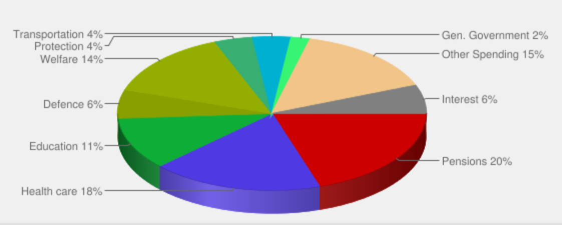
Shapely projections is a data visualization installation. The project is produced with information taken online from the UK Government spending plan. The piece is a reflection on the time and effort involved in Government spending within the UK. I have chosen the following seven topics to address: defence, health, welfare, education, pensions, transport and protection. The installation visually shows the direct comparison between the chosen topics, by looking at the size differences between the objects one can immediately see the topics that encapsulate the most/least spending.
The seven objects have been programmed in processing and made physical with a 3D printer. I want the viewer to reflect and be able to relate to these objects as something that has had in impact on their life. Each object exhibited has been influenced with the UK Government spending plan from 2005 to 2020. The shapes were then exported from processing as a OBJ file, then they were exported from Blender as stl files and 3D printed to create the final product. The time taken to print each object was a symbolic part of the process as this was an indication of how much time and effort was put into each category.
Shapely projections is an exploration of data that in some way has effected my life and people that surround me. Each category has been made into something physical, a distorted sphere. My intention was to make the data easy to interpret, unlike like complicated statistics graphs which most people are uninterested in.
Audience
I wanted my audience to question the data, as some of the shapes were evidently larger than others. The objects were there to be observed and interacted with. I saw the shapes as a fragment of the past, present and future that I wanted the audience to reflect on, and how in some way or another this data had influenced their life. The information I had chosen to work with is relatable to an audiences of all ages, from a young aged citizen to a very old one. As the data swings from pensions to education to transport. I intended the audience to be surprised by some of the data as I was to during the creation process. The audience was most surprised by the size of pensions in comparison to defence, pensions was the largest shape by far. The more I spent time with these shapes the more I was effected and surprised by their sizes. I wanted a similar impact on the audience. My aim was to create some sort of interaction with the audience and my seven shapes. A moment of surpise or questionability.
Process
My first step was to find data that would be interesting to the viewer, I wanted to find data that the viewer could relate to no matter the age or gender. I had to find data that was easily accessible online and something that would influence different shapes. I then thought of using government data and came across the spending plan very quickly whilst surfing the web. I downloaded CSV filed into excel and sorted through which bits I wanted and was going to use in my code. So I simiplied the data in excel down to the year and the total amount in billions spent from 2005-2020. I then compared each category to try get an idea of how the shapes would be in comparison to one another.
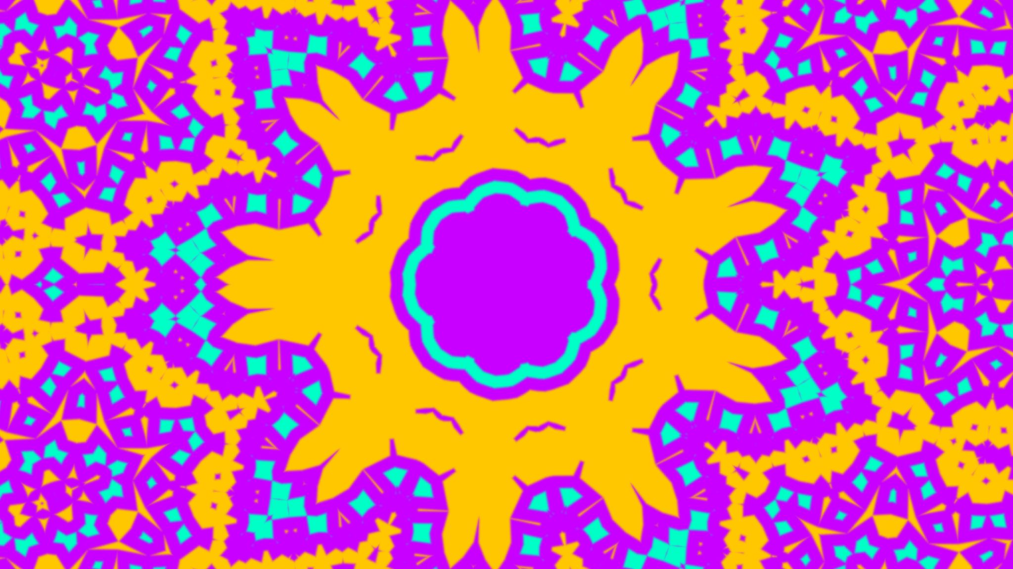
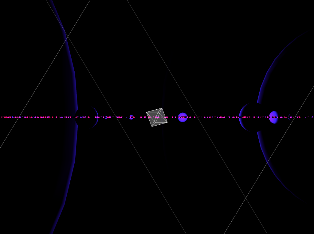
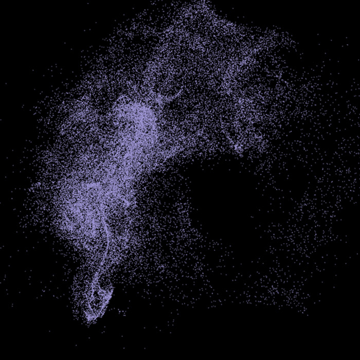
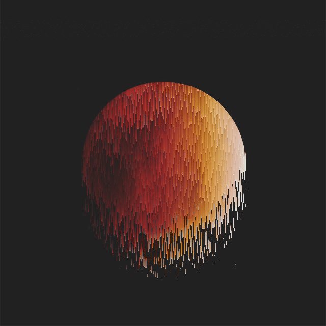
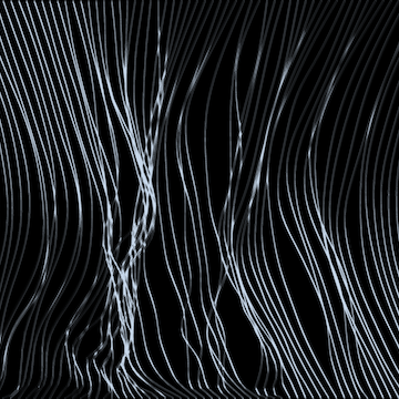
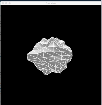
After getting the appropriate data, I could start coding the spheres. I used processing to code each sphere, once I had a protocol code I could do the same to each category. In the beginning I wasn't getting the kind of sphere I wanted because I was using the built in function sphere() in processing and not creating the sphere from scratch. I was getting shapes that looked like this:
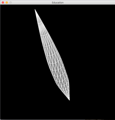
I then thought it would be better to code the sphere from scratch and I found a Daniel Shiftman video that would help me do this. After creating each sphere, I realized I wasn't multiplying the radius by the correct thing. I ended up making the radius equal to the array of numbers and then adding noise to distort it. If I didn't distort the sphere each shape looked similar. To prevent the shapes from looking very similar this was the code I added:
r += noise(x * 2,y * 2,z * 2) * 100
Each sphere reacted differently to the noise added. After a few technical challenges I finally got what I needed to print the shapes I aesthetically wanted.
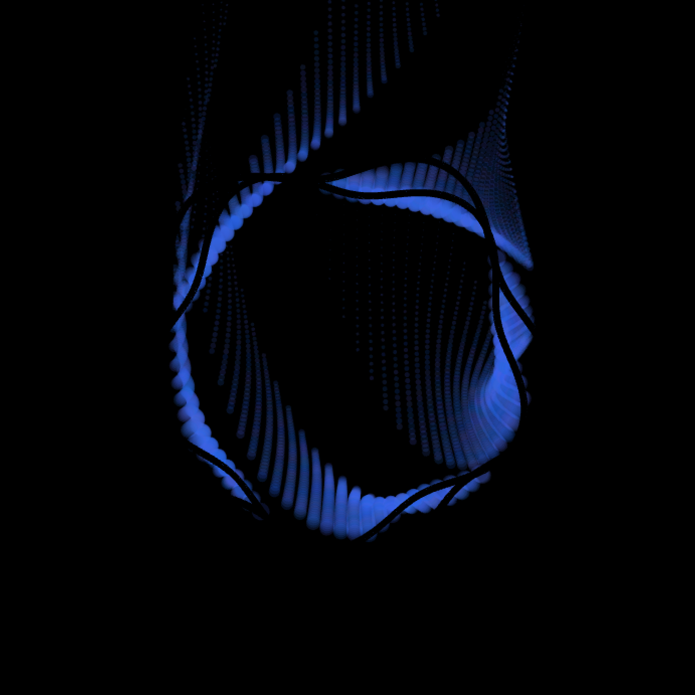
Below: A sphere that hasn't been affected by noise and a sphere that has.
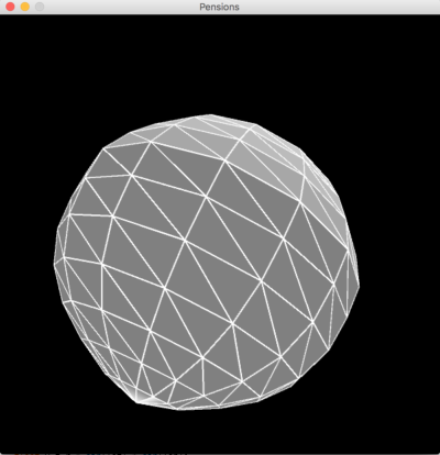
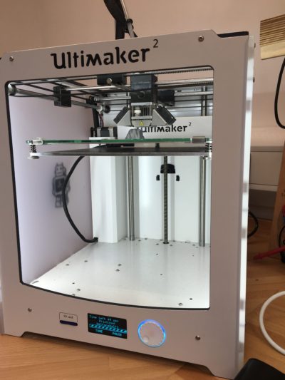
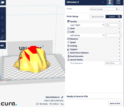
Once I had finalized the code I could go straight into the printing of the objects. First I had to decide which printer would successfully contribute to the work in the way I imagined. I had the idea of using the laser cutter which would layer each part of the sphere from the top to bottom and soon realized this was going to be complicated. So that’s when I decided to use the 3D printer. In the first two test prints I did, I came across a setback. The support that was stopping the ball from falling over in the printer was influencing the shape of the object at the bottom. I tried to cut the support off but it ended up messing up the shape of the object. I then decided to print each half of the sphere and then glue them together creating a whole out of both halves. After I had the small spheres templates finished and I was ready to print the final pieces I had to decide what size was suitable to print. For the test prints I had scaled the spheres down to 10% as I needed them to be printed as quickly as possible. I had to choose a scaling size that would be possible for printing in the Ultimaker software, I decided to go with 40% as it was the biggest size I could go. After checking all the printing times for each shape I realized pensions would be too large as it would take 2 days to print.
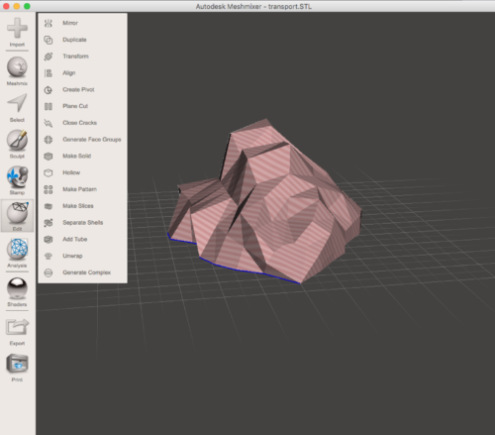
I split my shapes in half using meshmixer, I had to make sure I wasn’t printing the same side twice. I imported the shapes into the program then flipped the shape on the Z axis by 180 and performed and action called “plane cut” this deleted the part that was underneath the plane. This is how I got to my two halves of the sphere.
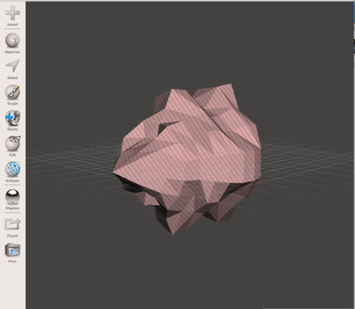
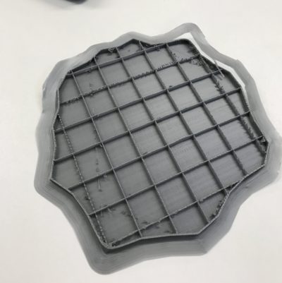
I had to print test prints first before printing all the final pieces, I landed up with a many tiny spheres. This was necessary as I had to check if I had the correct halves printed and the shapes reacted correctly to the material used. Below is an image of half of the test print for Welfare almost complete.
Whilst printing welfare and healthcare, I had by mistake printed two of the same halves and realized whilst gluing them together I had to flip them on the correct axis. So I used the Cura software to compare the halves I had to the half that still needed to be printed. Once I saw that it would fit the half I had printed, I had to print two more again.
I came across two main issues whilst printing the final pieces. For defence the printer ran out of material and couldn’t finish the job, leaving a hole at the top of the shape. For welfare the material was loaded in incorrectly and only printed the base of the shape. I realized problems like this were unavoidable and the more I came across small problems the more a learnt about the printers and how their functionality.
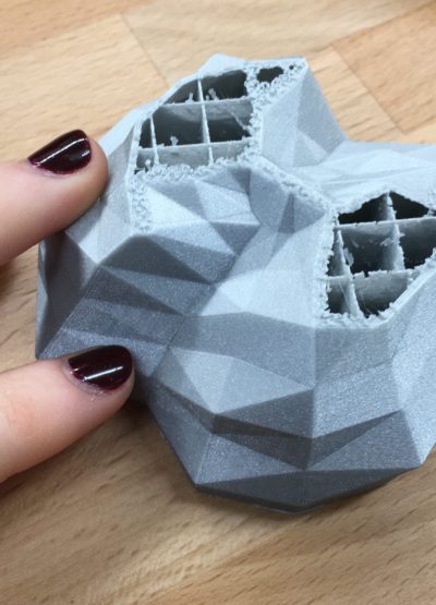
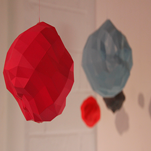
When I had all my 14 halves I could start gluing them together and attaching the fishing wire that would support the shapes from the ceiling. Seeing the shapes glued together was a very rewarding part of the project
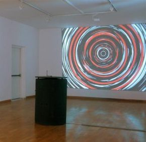
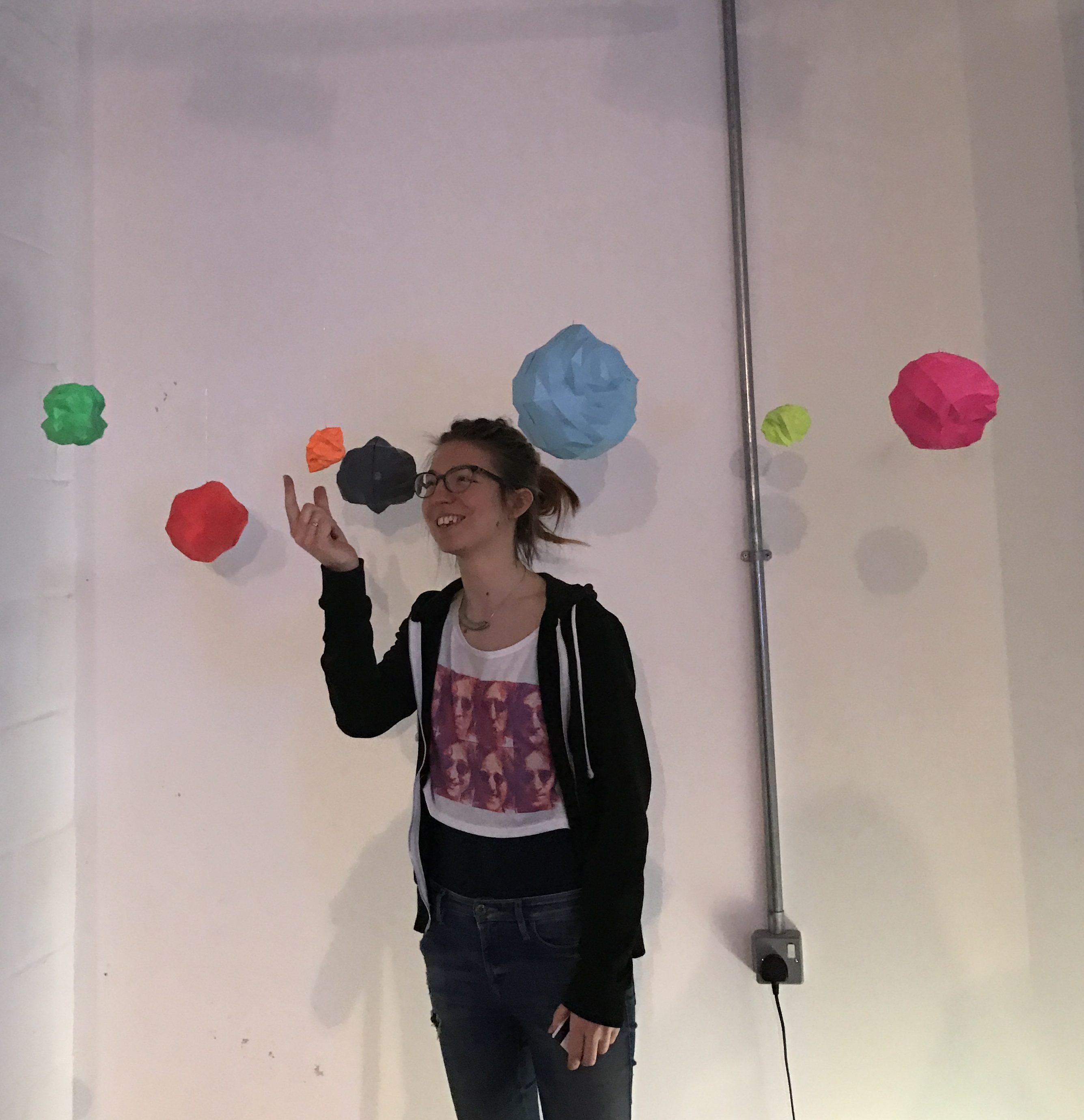
Initially I imaged having four shapes being displayed on plinths in glass boxes. After putting more thought into the display of the objects I decided I wanted to break the cliché idea of using plinths in a gallery space and display the shapes hanging from the ceiling. I decided that four shapes would not be effective hanging from the ceiling. This is where I made the decision to print more shapes so I collected more data from the internet, the categories I added were: protection and transport. I then decided that I was going to print pensions, initially I thought it was too big but if I was going to have the shapes hanging I needed pensions to balance out the small ones. I knew that four shapes would be underwhelming. So in the end I was left with seven shapes and had a few days to print 3 more.
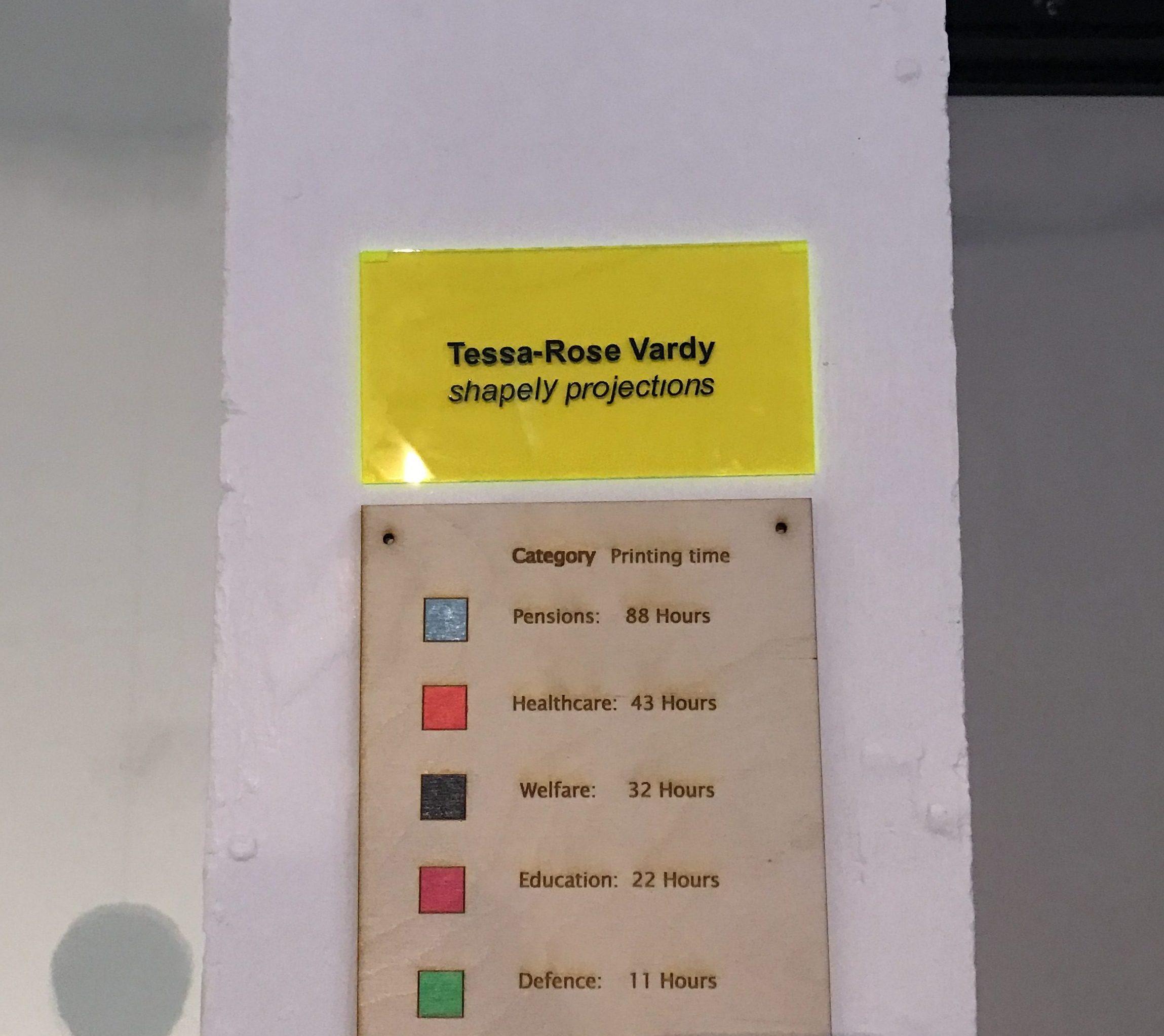
I decided to hang the shapes as I wanted the audience to be confronted with the data at eye level so they could walk around them and observe them from any angle they please. I didn’t want them to be restrained to only seeing them from a few perspectives. The objects were unavoidable and easy to interpret as I had a placard with each colour and the category next the piece so the viewer could see for themselves and differentiate each shape to the complimentary category. On the wooden placard I used the laser cutter to separate each category by colour and printing time, arranged from the largest printing time to the smallest. This was successful because it allowed the viewer to separate each shape in their mind and compare them to one another, which is what I intended the viewer to do. I thought that one of the most interesting layers of the data that was being displayed was its relationship to one another. I incorporated the printing time as I thought this was symbolic to how much was spent for each category, there more hours it took to print, the more money was put in.
The most symbolic part of the entire project was the printing time. This was the stage that was most metaphorical for me, I would spend hours in the labs sitting and waiting for these shapes to be created. While it was being printed it was out of my control, there was nothing I could to except sit, wait and hope for the best. I realized that’s all we really can do with the data I was using. To an extent it is out of our control, we just have to wait and hope for the best.